Power spectral density#
Generating a signal#
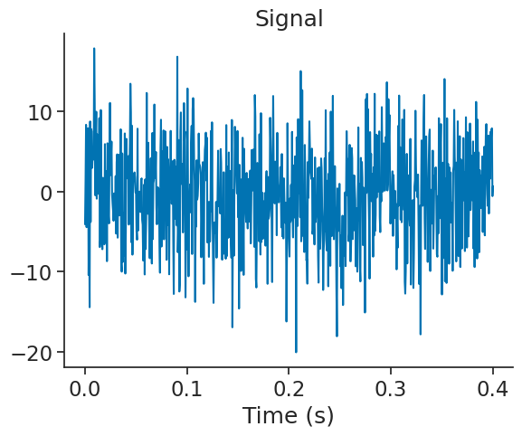
Let’s generate a dummy signal with 2Hz and 10Hz sinusoide with white noise.
F = [2, 10]

Fs = 2000
t = np.arange(0, 200, 1/Fs)
sig = nap.Tsd(
    t=t,
    d=np.cos(t*2*np.pi*F[0])+np.cos(t*2*np.pi*F[1])+2*np.random.normal(0, 3, len(t)),
    time_support = nap.IntervalSet(0, 200)
    )
Text(0.5, 0, 'Time (s)')
Computing FFT#
To compute the FFT of a signal, you can use the function nap.compute_fft. With norm=True, the output of the FFT is divided by the length of the signal.
fft = nap.compute_fft(sig, norm=True)
Pynapple returns a pandas DataFrame.
print(fft)
                          0
0.000    0.011106+0.000000j
0.005    0.007727-0.008474j
0.010   -0.001820-0.002742j
0.015   -0.012891-0.003335j
0.020   -0.000795+0.004115j
...                     ...
999.975 -0.004349+0.006227j
999.980  0.014552-0.003138j
999.985  0.002594-0.010448j
999.990  0.000994-0.001900j
999.995  0.004895+0.005587j

[200000 rows x 1 columns]
It is then easy to plot it.
plt.figure()
plt.plot(np.abs(fft))
plt.xlabel("Frequency (Hz)")
plt.ylabel("Amplitude")
Text(0, 0.5, 'Amplitude')
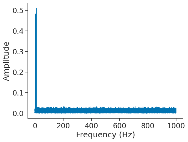
Note that the output of the FFT is truncated to positive frequencies. To get positive and negative frequencies, you can set full_range=True.
By default, the function returns the frequencies up to the Nyquist frequency.
Let’s zoom on the first 20 Hz.
plt.figure()
plt.plot(np.abs(fft))
plt.xlabel("Frequency (Hz)")
plt.ylabel("Amplitude")
plt.xlim(0, 20)
(0.0, 20.0)
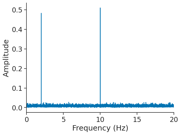
We find the two frequencies 2 and 10 Hz.
By default, pynapple assumes a constant sampling rate and a single epoch. For example, computing the FFT over more than 1 epoch will raise an error.
double_ep = nap.IntervalSet([0, 50], [20, 100])

try:
    nap.compute_fft(sig, ep=double_ep)
except ValueError as e:
    print(e)
Given epoch (or signal time_support) must have length 1
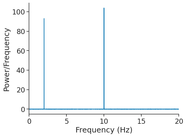
Computing power spectral density (PSD)#
Power spectral density can be returned through the function compute_power_spectral_density. Contrary to compute_fft, the
output is real-valued.
psd = nap.compute_power_spectral_density(sig, fs=Fs)
The output is also a pandas DataFrame.
plt.figure()
plt.plot(psd)
plt.xlabel("Frequency (Hz)")
plt.ylabel("Power/Frequency")
plt.xlim(0, 20)
(0.0, 20.0)
Computing mean PSD#
It is possible to compute an average PSD over multiple epochs with the function nap.compute_mean_power_spectral_density.
In this case, the argument interval_size determines the duration of each epochs upon which the FFT is computed.
If not epochs is passed, the function will split the time_support.
In this case, the FFT will be computed over epochs of 20 seconds.
mean_psd = nap.compute_mean_power_spectral_density(sig, interval_size=20.0, fs=Fs)
Let’s compare mean_psd to psd. In both cases, the output is normalized and converted to dB.
Text(0.5, 0, 'Frequency (Hz)')
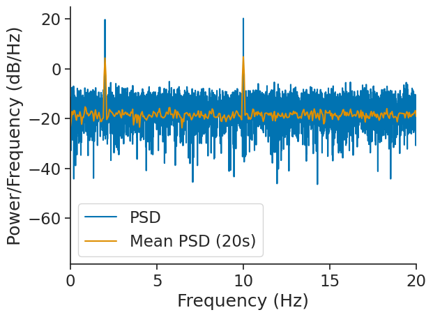
As we can see, nap.compute_mean_power_spectral_density was able to smooth out the noise.