Filtering#

The filtering module holds the functions for frequency manipulation:

The functions have similar calling signatures. For example, to filter a 1000 Hz signal between 10 and 20 Hz using a Butterworth filter:

>>> new_tsd = nap.apply_bandpass_filter(tsd, (10, 20), fs=1000, mode='butter')

Currently, the filtering module provides two methods for frequency manipulation: butter for a recursive Butterworth filter and sinc for a Windowed-sinc convolution. This notebook provides a comparison of the two methods.

Hide code cell content

import pynapple as nap
import numpy as np
import matplotlib.pyplot as plt
import seaborn as sns
custom_params = {"axes.spines.right": False, "axes.spines.top": False}
sns.set_theme(style="ticks", palette="colorblind", font_scale=1.5, rc=custom_params)

Basics#

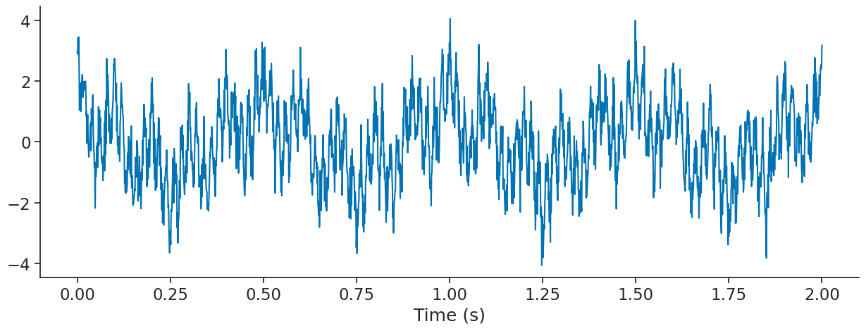
We start by generating a signal with multiple frequencies (2, 10 and 50 Hz).

fs = 1000 # sampling frequency
t = np.linspace(0, 2, fs * 2)
f2 = np.cos(t*2*np.pi*2)
f10 = np.cos(t*2*np.pi*10)
f50 = np.cos(t*2*np.pi*50)

sig = nap.Tsd(t=t,d=f2+f10+f50 + np.random.normal(0, 0.5, len(t)))

Hide code cell source

fig = plt.figure(figsize = (15, 5))
plt.plot(sig)
plt.xlabel("Time (s)")
Text(0.5, 0, 'Time (s)')
../_images/42eaf557322532f973baf55828be8d3a60088fe15ac7f0dc6a7acf7f6bcb1027.png

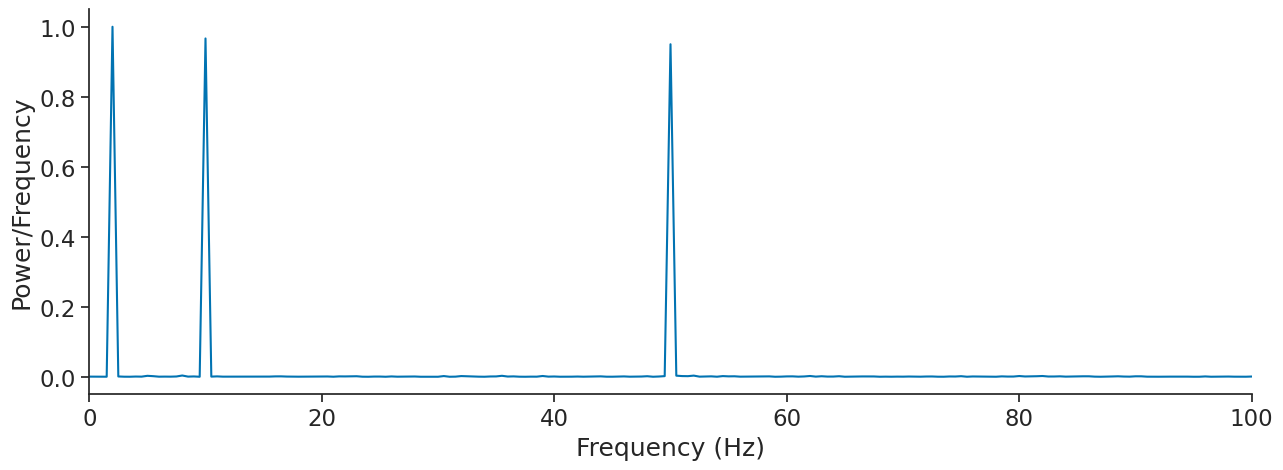
We can compute the Fourier transform of sig to verify that all the frequencies are there.

psd = nap.compute_power_spectral_density(sig, fs)

Hide code cell source

fig = plt.figure(figsize = (15, 5))
plt.plot(psd)
plt.xlabel("Frequency (Hz)")
plt.ylabel("Power/Frequency")
plt.xlim(0, 100)
(0.0, 100.0)
../_images/157c73d32fb46a75dcc222972d88f63e3793a4e0252d839de82e69f999e240d7.png

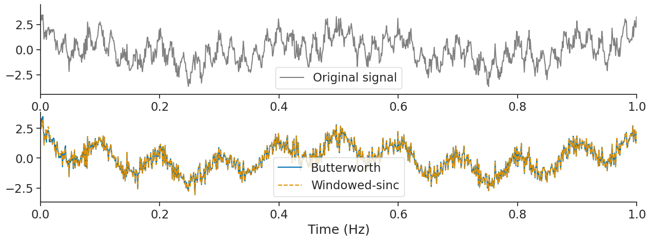
Let’s say we would like to see only the 10 Hz component. We can use the function apply_bandpass_filter with mode butter for Butterworth.

sig_butter = nap.apply_bandpass_filter(sig, (8, 12), fs, mode='butter')

Let’s compare it to the sinc mode for Windowed-sinc.

sig_sinc = nap.apply_bandpass_filter(sig, (8, 12), fs, mode='sinc', transition_bandwidth=0.003)

Hide code cell source

fig = plt.figure(figsize = (15, 5))
plt.subplot(211)
plt.plot(t, f10, '-', color = 'gray', label = "10 Hz component")
plt.xlim(0, 1)
plt.legend()
plt.subplot(212)
# plt.plot(sig, alpha=0.5)
plt.plot(sig_butter, label = "Butterworth")
plt.plot(sig_sinc, '--', label = "Windowed-sinc")
plt.legend()
plt.xlabel("Time (s)")
plt.xlim(0, 1)
(0.0, 1.0)
../_images/68675f158460bd0bccc1ec288abb96440a41b018439f2911aa1104e9e14dfe5f.png

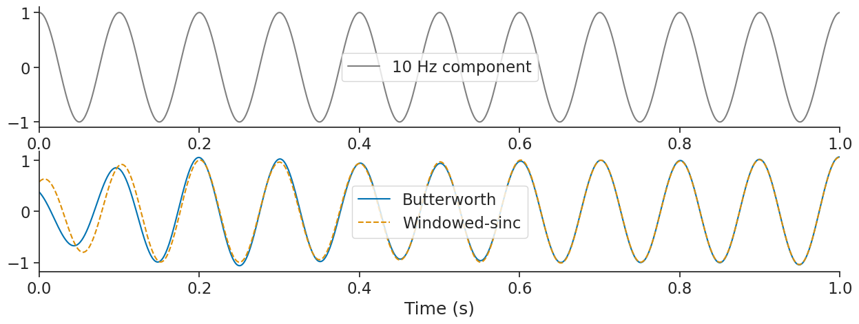
This gives similar results except at the edges.

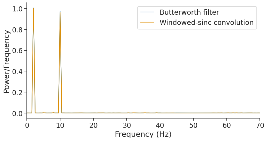
Another use of filtering is to remove some frequencies. Here we can try to remove the 50 Hz component in the signal.

sig_butter = nap.apply_bandstop_filter(sig, cutoff=(45, 55), fs=fs, mode='butter')
sig_sinc = nap.apply_bandstop_filter(sig, cutoff=(45, 55), fs=fs, mode='sinc', transition_bandwidth=0.004)

Hide code cell source

fig = plt.figure(figsize = (15, 5))
plt.subplot(211)
plt.plot(t, sig, '-', color = 'gray', label = "Original signal")
plt.xlim(0, 1)
plt.legend()
plt.subplot(212)
plt.plot(sig_butter, label = "Butterworth")
plt.plot(sig_sinc, '--', label = "Windowed-sinc")
plt.legend()
plt.xlabel("Time (Hz)")
plt.xlim(0, 1)
(0.0, 1.0)
../_images/51734b180c47bdba786ca6b5fc67b482040d6769e7eeae92a7a13815ef0c0e31.png

Let’s see what frequencies remain;

psd_butter = nap.compute_power_spectral_density(sig_butter, fs)
psd_sinc = nap.compute_power_spectral_density(sig_sinc, fs)

Hide code cell source

fig = plt.figure(figsize = (10, 5))
plt.plot(psd_butter, label = "Butterworth filter")
plt.plot(psd_sinc, label = "Windowed-sinc convolution")
plt.legend()
plt.xlabel("Frequency (Hz)")
plt.ylabel("Power/Frequency")
plt.xlim(0, 70)
(0.0, 70.0)
../_images/cfb5a5d101d66c5a9f8f91739025af21aa54985d293279d219b8916d398fc981.png

Inspecting frequency responses of a filter#

We can inspect the frequency response of a filter by plotting its FFT. To do this, we can use the get_filter_frequency_response function, which returns a pandas Series with the frequencies as the index and the amplitude as values.

Let’s extract the frequency response of a Butterworth filter and a sinc low-pass filter.

# compute the frequency response of the filters
psd_butter = nap.get_filter_frequency_response(
    200, fs,"lowpass", "butter", order=8
)
psd_sinc = nap.get_filter_frequency_response(
    200, fs,"lowpass", "sinc", transition_bandwidth=0.1
)

Hide code cell source

# compute the transition bandwidth
tb_butter = psd_butter[psd_butter > 0.99].index.max(), psd_butter[psd_butter < 0.01].index.min()
tb_sinc = psd_sinc[psd_sinc > 0.99].index.max(), psd_sinc[psd_sinc < 0.01].index.min()

fig, axs = plt.subplots(1, 2, sharex=True, sharey=True, figsize=(15, 5))
fig.suptitle("Frequency response", fontsize="x-large")
axs[0].set_title("Butterworth Filter")
axs[0].plot(psd_butter)
axs[0].axvspan(0, tb_butter[0], alpha=0.4, color="green", label="Pass Band")
axs[0].axvspan(*tb_butter, alpha=0.4, color="orange", label="Transition Band")
axs[0].axvspan(tb_butter[1], 500, alpha=0.4, color="red", label="Stop Band")
axs[0].legend().get_frame().set_alpha(1.)
axs[0].set_xlim(0, 500)
axs[0].set_xlabel("Frequency (Hz)")
axs[0].set_ylabel("Amplitude")

axs[1].set_title("Sinc Filter")
axs[1].plot(psd_sinc)
axs[1].axvspan(0, tb_sinc[0], alpha=0.4, color="green", label="Pass Band")
axs[1].axvspan(*tb_sinc, alpha=0.4, color="orange", label="Transition Band")
axs[1].axvspan(tb_sinc[1], 500, alpha=0.4, color="red", label="Stop Band")
axs[1].legend().get_frame().set_alpha(1.)
axs[1].set_xlabel("Frequency (Hz)")

print(f"Transition band butterworth filter: ({int(tb_butter[0])}Hz, {int(tb_butter[1])}Hz)")
print(f"Transition band sinc filter: ({int(tb_sinc[0])}Hz, {int(tb_sinc[1])}Hz)")
Transition band butterworth filter: (164Hz, 290Hz)
Transition band sinc filter: (146Hz, 268Hz)
../_images/29d5ffc5d697e82bf17b672655cab6a071261d5f69cb40135fb744feef2d6db9.png

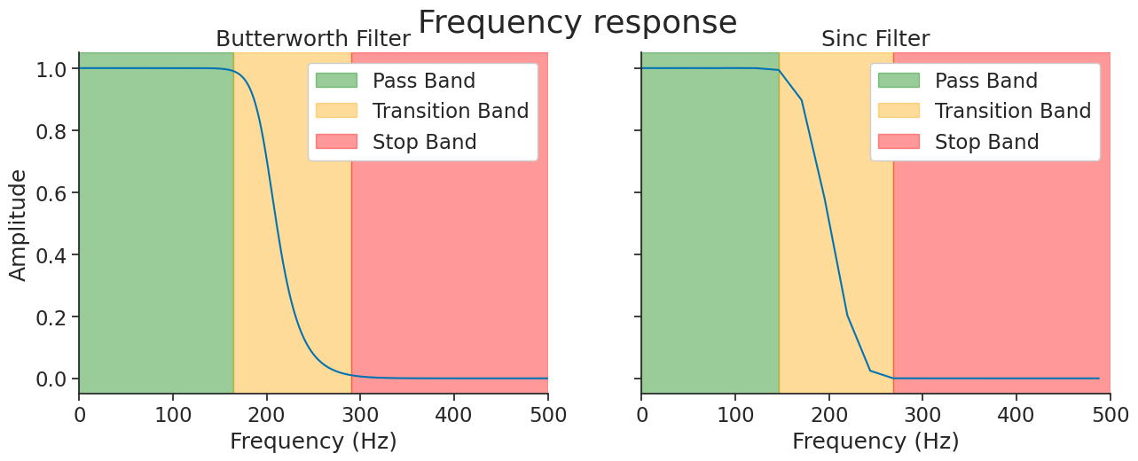
The frequency band with response close to one will be preserved by the filtering (pass band), the band with response close to zero will be discarded (stop band), and the band in between will be partially attenuated (transition band).

Note

Here, we define the transition band as the range where the amplitude attenuation is between 99% and 1%. The transition_bandwidth parameter of the sinc filter is approximately the width of the transition band normalized by the sampling frequency. In the example above, if you divide the transition band width of 122Hz by the sampling frequency of 1000Hz, you get 0.122, which is close to the 0.1 value set.

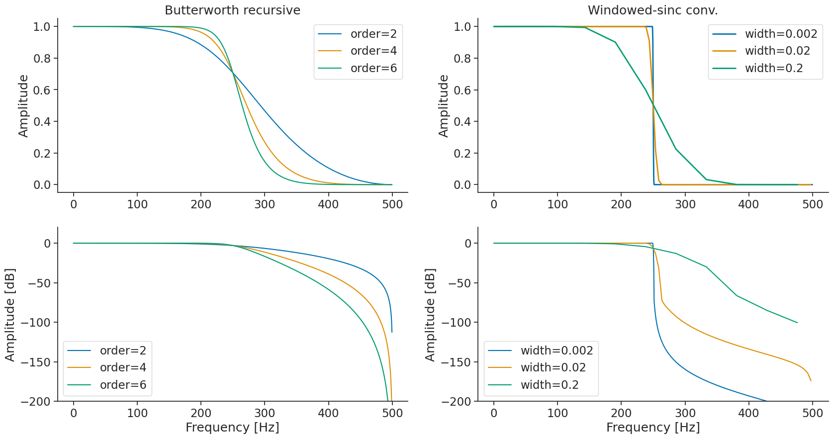
You can modulate the width of the transition band by setting the order parameter of the Butterworth filter or the transition_bandwidth parameter of the sinc filter. First, let’s get the frequency response for a Butterworth low pass filter with different order:

butter_freq = {
    order: nap.get_filter_frequency_response(250, fs, "lowpass", "butter", order=order)
    for order in [2, 4, 6]}

… and then the frequency response for the Windowed-sinc equivalent with different transition bandwidth.

sinc_freq = {
    tb: nap.get_filter_frequency_response(250, fs,"lowpass", "sinc", transition_bandwidth=tb)
    for tb in [0.002, 0.02, 0.2]}

Let’s plot the frequency response of both.

Hide code cell source

fig = plt.figure(figsize = (20, 10))
gs = plt.GridSpec(2, 2)
for order in butter_freq.keys():
    plt.subplot(gs[0, 0])
    plt.plot(butter_freq[order], label = f"order={order}")
    plt.ylabel('Amplitude')
    plt.legend()
    plt.title("Butterworth recursive")
    plt.subplot(gs[1, 0])
    plt.plot(20*np.log10(butter_freq[order]), label = f"order={order}")
    plt.xlabel('Frequency [Hz]')
    plt.ylabel('Amplitude [dB]')
    plt.ylim(-200,20)
    plt.legend()

for tb in sinc_freq.keys():
    plt.subplot(gs[0, 1])
    plt.plot(sinc_freq[tb], linewidth=2, label= f"width={tb}")
    plt.ylabel('Amplitude')
    plt.legend()
    plt.title("Windowed-sinc conv.")
    plt.subplot(gs[1, 1])
    plt.plot(20*np.log10(sinc_freq[tb]), label= f"width={tb}")
    plt.xlabel('Frequency [Hz]')
    plt.ylabel('Amplitude [dB]')
    plt.ylim(-200,20)
    plt.legend()
../_images/ce9b7402d90a79501bea1141492141d4e18d7e8f54384920f83a11b5060c69f5.png

Warning

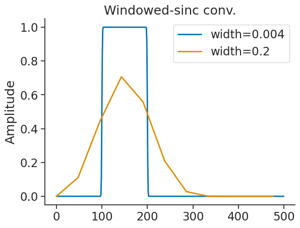
In some cases, the transition bandwidth that is too high generates a kernel that is too short. The amplitude of the original signal will then be lower than expected. In this case, the solution is to decrease the transition bandwidth when using the windowed-sinc mode. Note that this increases the length of the kernel significantly. Let see it with the band pass filter.

sinc_freq = {
    tb:nap.get_filter_frequency_response((100, 200), fs, "bandpass", "sinc", transition_bandwidth=tb)
    for tb in [0.004, 0.2]}
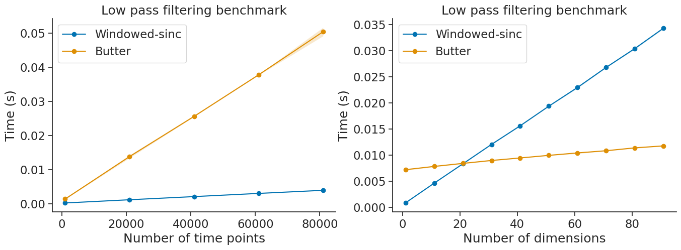
Hide code cell source

fig = plt.figure()
for tb in sinc_freq.keys():
    plt.plot(sinc_freq[tb], linewidth=2, label= f"width={tb}")
    plt.ylabel('Amplitude')
    plt.legend()
    plt.title("Windowed-sinc conv.")
    plt.legend()
../_images/542e074d2ba6a207607f64b04698a573ebebd651faca54fc6d630da62e5e50f0.png

Performances#

Let’s compare the performance of each when varying the number of time points and the number of dimensions.

Hide code cell source

from time import perf_counter

def get_mean_perf(tsd, mode, n=10):
    tmp = np.zeros(n)
    for i in range(n):
        t1 = perf_counter()
        _ = nap.apply_lowpass_filter(tsd, 0.25 * tsd.rate, mode=mode)
        t2 = perf_counter()
        tmp[i] = t2 - t1
    return [np.mean(tmp), np.std(tmp)]

def benchmark_time_points(mode):
    times = []
    for T in np.arange(1000, 100000, 20000):
        time_array = np.arange(T)/1000
        data_array = np.random.randn(len(time_array))
        startend = np.linspace(0, time_array[-1], T//100).reshape(T//200, 2)
        ep = nap.IntervalSet(start=startend[::2,0], end=startend[::2,1])
        tsd = nap.Tsd(t=time_array, d=data_array, time_support=ep)
        times.append([T]+get_mean_perf(tsd, mode))
    return np.array(times)

def benchmark_dimensions(mode):
    times = []
    for n in np.arange(1, 100, 10):
        time_array = np.arange(10000)/1000
        data_array = np.random.randn(len(time_array), n)
        startend = np.linspace(0, time_array[-1], 10000//100).reshape(10000//200, 2)
        ep = nap.IntervalSet(start=startend[::2,0], end=startend[::2,1])
        tsd = nap.TsdFrame(t=time_array, d=data_array, time_support=ep)
        times.append([n]+get_mean_perf(tsd, mode))
    return np.array(times)


times_sinc = benchmark_time_points(mode="sinc")
times_butter = benchmark_time_points(mode="butter")

dims_sinc = benchmark_dimensions(mode="sinc")
dims_butter = benchmark_dimensions(mode="butter")


plt.figure(figsize = (16, 5))
plt.subplot(121)
for arr, label in zip(
    [times_sinc, times_butter],
    ["Windowed-sinc", "Butter"],
    ):
    plt.plot(arr[:, 0], arr[:, 1], "o-", label=label)
    plt.fill_between(arr[:, 0], arr[:, 1] - arr[:, 2], arr[:, 1] + arr[:, 2], alpha=0.2)
plt.legend()
plt.xlabel("Number of time points")
plt.ylabel("Time (s)")
plt.title("Low pass filtering benchmark")
plt.subplot(122)
for arr, label in zip(
    [dims_sinc, dims_butter],
    ["Windowed-sinc", "Butter"],
    ):
    plt.plot(arr[:, 0], arr[:, 1], "o-", label=label)
    plt.fill_between(arr[:, 0], arr[:, 1] - arr[:, 2], arr[:, 1] + arr[:, 2], alpha=0.2)
plt.legend()
plt.xlabel("Number of dimensions")
plt.ylabel("Time (s)")
plt.title("Low pass filtering benchmark")
Text(0.5, 1.0, 'Low pass filtering benchmark')
../_images/d62c5cbe1f456fed846f4b3bc4020765cc8e23363d9fa6c98bc55abe81b4ad07.png

Detecting Oscillatory Events#

The filtering module also provides a method detect_oscillatory_events to automatically detect intervals containing oscillatory events (such as ripples or spindles) in a signal.

To demonstrate, let’s create a synthetic signal where a fast oscillation (e.g., 40 Hz) occurs in a noisy signal:

# Parameters
fs = 1000  # Sampling frequency (Hz)
duration = 3  # seconds
t = np.linspace(0, duration, int(fs * duration))

# 40 Hz oscillation
osc = np.sin(2 * np.pi * 40 * t)
signal = np.zeros_like(t) + 0.2 * np.random.randn(len(t))
mask = (t > 1) & (t < 1.5)
signal[mask] += osc[mask]

# Create Tsd object
ts = nap.Tsd(t=t, d=signal)

Hide code cell source

# Plot the signal
plt.figure(figsize=(15, 4))
plt.plot(ts, label="Signal (40 Hz oscillation)")
plt.xlabel("Time (s)")
plt.ylabel("Amplitude")
plt.title("Signal with oscillatory bursts")
plt.legend()
plt.show()
../_images/ec2536b0c064f914252d320d6ff0fd9d2bb52de0741336df9819c247951ed8da.png

Now, let’s use detect_oscillatory_events to find the oscillation intervals. The function will return the detected intervals as an IntervalSet along with metadata containing peak times.

# Define detection parameters
freq_band = (35, 45)  # Bandpass filter for 40 Hz
thres_band = (1, 10)  # Thresholds for normalized squared signal
min_dur = 0.03        # Minimum event duration (s)
max_dur = 1           # Maximum event duration (s)
min_inter = 0.02      # Minimum interval between events (s)
epoch = nap.IntervalSet(start=0, end=duration)

# Detect oscillatory events
osc_ep = nap.filtering.detect_oscillatory_events(
    ts, epoch, freq_band, thres_band, (min_dur, max_dur), min_inter
)

print("Detected intervals:\n", osc_ep)
Detected intervals:
   index    start      end    power    amplitude    peak_time
      0  1.02334  1.47849    -3.03         1.09         1.39
shape: (1, 2), time unit: sec.

Let’s visualize the detected intervals and peaks on the original signal:

Hide code cell source

plt.figure(figsize=(15, 4))
plt.plot(ts, label="Signal")
for s, e in osc_ep.values:
    plt.axvspan(s, e, color="orange", alpha=0.3)
plt.xlabel("Time (s)")
plt.ylabel("Amplitude")
plt.title("Detected oscillatory events")
plt.legend()
plt.show()
../_images/4db0f5ad31514a97a784ec65eb8934f87cf43761dc47c8e834bf6d09d3c5649c.png